
Braille Signs for Apartments: A Builder’s Guide to NCC Compliance
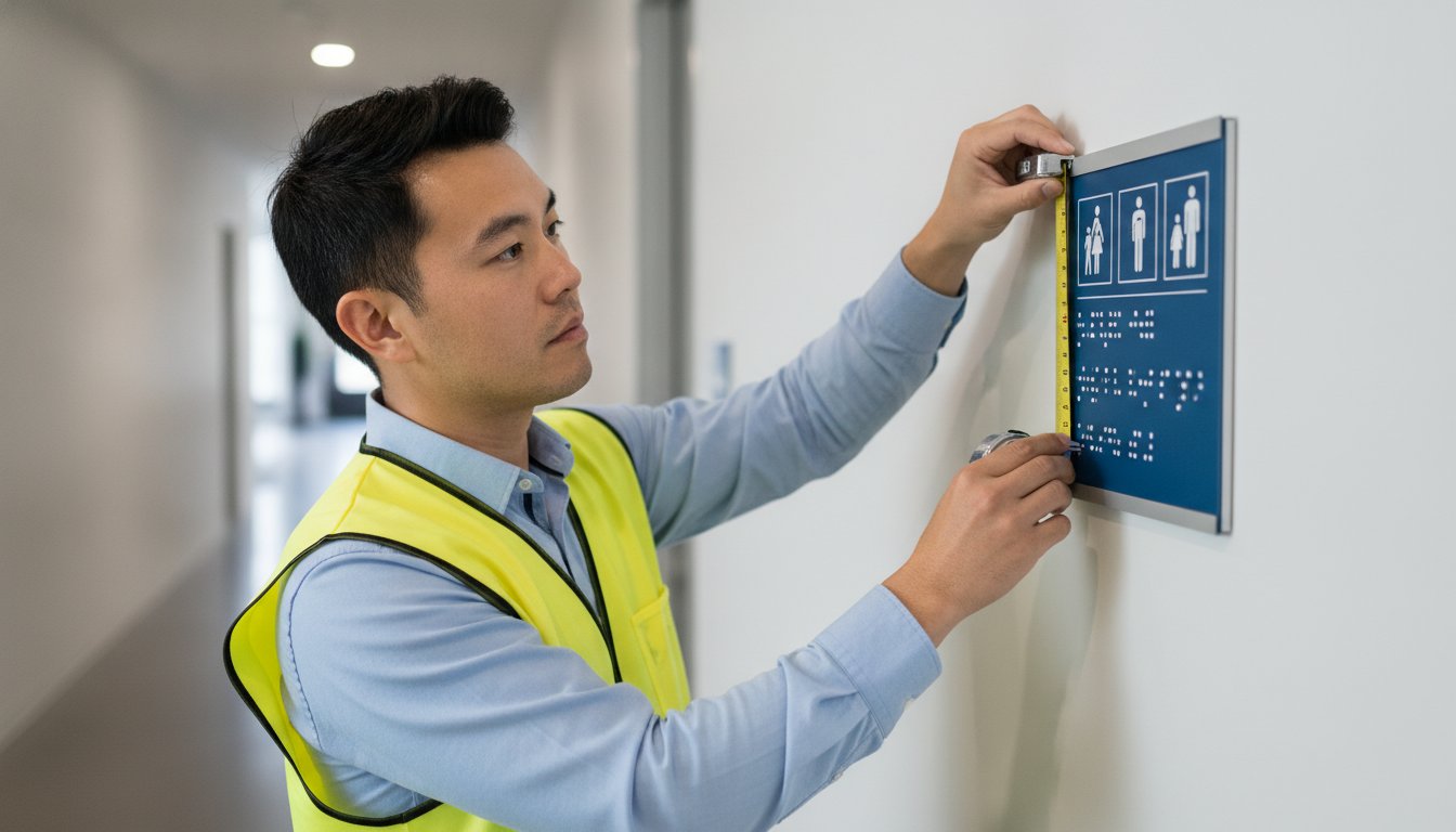
A single non-compliant sign can stall your occupation certificate and delay project handover by weeks. When installing braille signs for apartments, even a minor deviation from NCC Specification 15 can result in a failed final inspection. It is a high-stakes detail that often causes unnecessary stress for builders and developers during the final stages of a residential build.
You likely understand the frustration of balancing modern architectural aesthetics with the rigid technicalities of AS 1428.1-2021. Ensuring every tactile element meets the 30% luminance contrast requirement while maintaining a premium finish is a precise manufacturing task. You need a solution that satisfies both the building surveyor and the design brief without compromise. Peace of mind comes from knowing your signage is durable, legible, and legally sound.
This guide provides the technical clarity required to master apartment signage compliance. We will outline the mandatory mounting heights, essential room identification requirements, and material choices that ensure long-term durability. You will gain a clear checklist to navigate NCC 2022 standards and secure your final inspection with confidence.
Key Takeaways
- Identify the mandatory locations for braille signs for apartments to ensure your Class 2 building meets the latest NCC 2022 requirements.
- Master the technical specifications of AS 1428.1-2021, including the precise 0.8mm to 0.9mm tactile character height needed for regulatory compliance.
- Avoid inspection failure by calculating the 30% luminance contrast required between the sign face and the mounting surface.
- Choose high-performance materials like anodised aluminium or polypropylene to ensure signage remains legible and intact in high-traffic residential corridors.
- Streamline the certification process by sourcing Australian-made signage designed specifically for multi-residential environments and fire safety standards.
Understanding the NCC Requirements for Apartment Signage
NCC Section D3.6 is the primary regulation governing the design and placement of braille signage in Australian buildings. For builders managing Class 2 residential projects, adherence to this section is a mandatory step in the final certification process. The National Construction Code (NCC) dictates that specific functional areas within these developments must be clearly identified through tactile and braille elements. This ensures that all residents and visitors, including those who rely on the Braille tactile writing system, can navigate the built environment safely and independently. Compliance is not a suggestion. Non-compliant signage is a frequent cause of failed inspections, which directly prevents the timely issuance of an Occupation Certificate (OC).
Installing the correct braille signs for apartments requires a precise understanding of which spaces require identification. The code specifies that signage is necessary for all functional spaces, including fire exits, accessible amenities, and common area facilities. These signs must meet the technical standards outlined in NCC Specification 15 and AS 1428.1-2021. Failure to install compliant signs during the construction phase often leads to expensive retrofitting and project delays.
Where are braille signs mandatory in residential blocks?
Tactile signage must be positioned in all common-use areas of an apartment complex. This includes the identification of sanitary facilities, such as unisex accessible toilets or ambulant cubicles found in shared lobbies, gyms, or rooftop garden areas. Every floor level within a fire-isolated stairwell or lift lobby must be identified with a tactile sign. Directional signage is also required when the path to an accessible entrance or facility is not immediately obvious. Builders must ensure that braille signs for apartments are placed on the latch side of doors to remain compliant with mounting location rules.
The role of tactile characters in emergency wayfinding
Fire safety signage must incorporate tactile characters to remain functional during emergency scenarios. In the event of a power failure or heavy smoke, standard visual indicators may become obscured or invisible. Tactile "Exit" and floor level indicators allow individuals to navigate toward safety by touch alone. The NCC requires these indicators to be embossed, providing a reliable physical reference point. These signs must be integrated near fire indicator panels, hydrant points, and all fire-isolated exits. Precision in manufacturing ensures these tactile elements remain legible under extreme conditions and high-traffic wear.
Key Regulatory Standards: AS1428.1 and Section D3.6
AS1428.1-2021 provides the technical specifications required to meet the National Construction Code (NCC). It is the definitive guide for designing braille signs for apartments. Every physical attribute, from character height to dot curvature, is regulated to ensure accessibility for all users. Precision manufacturing is the only way to guarantee these signs pass a building surveyor's inspection. Accuracy is paramount because a single millimetre of error can render braille signs for apartments non-compliant during the final project audit.
Tactile characters must be raised between 0.8mm and 0.9mm from the base plate. This measurement is non-negotiable. If the relief is too shallow, the text becomes illegible to the touch; if it is too high, the characters can be difficult to trace. Braille must be Grade 1, which is uncontracted, to ensure universal readability. This format ensures that every letter is clearly defined, supporting the widest possible range of people with vision impairment. Using Grade 1 braille avoids the confusion that contracted shorthand can cause for residents in a multi-residential environment.
Tactile character requirements
Tactile characters must be between 15mm and 55mm high. This range provides enough surface area for finger-tip recognition without overcomplicating the sign layout. Fonts must be sans serif to avoid the tactile noise created by decorative serifs. Arial is the industry standard for this reason. Using title case or sentence case is often more effective than all-caps. The distinct shapes of lowercase letters aid in faster identification by touch. All characters must be consistent in depth and profile across the entire signage package to maintain a professional finish.
Braille cell specifications
Braille dots must have a domed profile. Flat-topped or pointed dots are non-compliant and fail to provide the necessary tactile feedback. They can also be uncomfortable or even sharp to the touch. Section 7 of AS1428.1 dictates the precise spacing between dots and cells. Braille must be located 8mm to 15mm below the tactile text or symbols. This placement allows the user to find the braille quickly after identifying the primary pictogram or text. Consistency in dot height across a multi-residential project is a hallmark of quality manufacturing. Ensuring your project meets these exact tolerances is simpler when using a specialist manufacturer of compliant signage.
Material Selection: Balancing Durability and Aesthetics
Corridors in multi-residential developments are high-wear environments. Signage must resist constant physical impact and chemical exposure from daily cleaning cycles. Choosing the right material for braille signs for apartments ensures the building remains compliant for its entire lifecycle. Poorly chosen materials often lead to tactile characters chipping or braille dots detaching. This results in a failure to meet the standards maintained by the Australian Braille Authority. Reliability in manufacturing is the only way to avoid these long-term maintenance issues and the risk of future non-compliance.
Material choice impacts both the budget and the final aesthetic of the project. Builders must select finishes that provide the necessary luminance contrast while matching the interior design brief. High-quality braille signs for apartments should be a "fit and forget" solution. They need to be robust enough to withstand the rigours of a busy residential block without losing their tactile properties.
Polypropylene: The versatile choice
Polypropylene is the industry standard for durability and cost-effectiveness. It is a non-corrosive, lightweight material that performs exceptionally well in all indoor environments. Injected-moulded designs are superior because the tactile elements are part of the sign body rather than being applied as separate pieces. This prevents braille dots from being picked off or worn down by friction. We provide several colour options to suit any interior scheme:
- Blue Polypropylene Signs: The standard choice for high visibility in accessible amenities.
- Silver Polypropylene Signs: Offers a metallic appearance with the weight and cost benefits of plastic.
- Charcoal Polypropylene Signs: A modern, neutral option for contemporary apartment corridors.
- Black Polypropylene Signs: A high-contrast choice for light-coloured mounting surfaces.
These signs are easy to install. Their lightweight nature allows for secure mounting on various wall types, including plasterboard and masonry, using high-bond adhesives.
Premium metals for architectural consistency
Boutique developments often require a more sophisticated finish to match premium building hardware. Metal signage provides a sleek, modern look that complements elements like door handles and lift plates. Selecting metal options ensures the signage package aligns with the architectural vision without sacrificing regulatory precision.
- Anodised Aluminium Signs: These offer a matte, low-sheen finish that prevents glare, which is a key requirement for visual legibility under corridor lighting.
- Stainless Steel Signs: These provide maximum durability and are ideal for coastal environments where salt air can corrode standard materials.
Metal options provide the highest level of impact resistance. They are a dependable choice for projects where longevity is the priority. Matching the material of your fire signage and exit indicators creates a uniform, professional aesthetic throughout the residential block.

Installation and Contrast: Ensuring a Final Pass
Luminance contrast is the most frequent point of failure during final building inspections. Even if the braille signs for apartments are manufactured to the correct dimensions, they remain non-compliant if they cannot be easily distinguished from the mounting surface. The 30% contrast rule applies to both the sign-to-wall and the character-to-sign background. This double requirement ensures the sign is visible against the corridor wall and the tactile characters are legible against the sign face. Builders must coordinate with painters and signage suppliers early to avoid costly rectifications after the walls are finished.
Compliance depends on the Light Reflectance Value (LRV) of the materials used. The NCC and AS 1428.1 require a minimum 30% difference in LRV between the sign and the wall. If a sign is mounted on a glass surface, the contrast is measured against the background visible through the glass. Precision in these measurements is critical. You can order compliant braille signs for apartments that meet these specific contrast benchmarks for your project.
How to calculate LRV contrast
Light Reflectance Value (LRV) measures the percentage of light a surface reflects. Most major paint manufacturers provide LRV data for their colour ranges. To calculate the contrast, subtract the lower LRV from the higher LRV and divide by the higher LRV. Black Polypropylene Signs are often the safest choice for light-coloured corridors, such as those painted in "Off White" or "Natural White," as they provide maximum contrast. For neutral backgrounds like grey or beige, Charcoal Polypropylene Signs or Blue Polypropylene Signs can be used to achieve the 30% threshold while maintaining a specific design aesthetic.
Mounting height and position
Placement is just as important as the sign itself. Signs must be located between 1200mm and 1600mm above the finished floor level. For single-line signs, the tactile characters must be positioned between 1250mm and 1350mm from the floor. This height range ensures the sign is accessible to both standing individuals and wheelchair users. Placement on the latch side of the door is mandatory. This allows a person with vision impairment to locate the sign safely without being struck by a door opening toward them. The leading edge of the sign must be between 50mm and 300mm from the door architrave. Ensure there is unobstructed access to the sign, with no fire extinguishers or furniture blocking the tactile elements.
Pictobraille: Australian-Made Solutions for Multi-Residential Developments
Pictobraille manufactures all signs in-house to ensure strict adherence to AS1428.1. This domestic production model allows for rigorous quality control at every stage of the manufacturing process. Builders and developers receive signage that is guaranteed to meet Australian standards, reducing the likelihood of inspection failures. Working directly with a manufacturer provides the technical assurance needed for complex multi-residential projects. Precision is our priority, and every sign is checked against NCC Specification 15 before it leaves our facility.
Our range encompasses everything required for a full building handover. This includes standard fire signage and slim exit signs designed for space-constrained areas. Modern apartment designs often feature narrow corridors where standard sign dimensions may not fit. Slim tactile indicators solve this issue while maintaining the mandatory character heights and braille spacing. Custom manufacturing also allows for bespoke room numbering and wayfinding that matches the specific brand of your residential project. We ensure that your braille signs for apartments are both functional and visually consistent with the building’s design.
Standard and custom residential range
The product selection caters to both budget-conscious and luxury developments. We offer a variety of materials to suit different architectural requirements:
- Blue and charcoal polypropylene signs: These offer a durable, cost-effective solution for standard compliance in common areas and stairwells.
- Custom stainless steel and anodised aluminium: Ideal for high-end residential towers, these premium materials match high-quality door hardware and architectural finishes.
- Slim tactile exit signs: These are designed specifically for narrow apartment corridors where wall space is at a premium.
These metal options ensure that braille signs for apartments complement the interior hardware of the project without sacrificing regulatory precision. Every material we use is selected for its longevity and resistance to the wear and tear of high-traffic residential environments.
Streamlining your procurement
Direct-to-manufacturer supply ensures competitive pricing and fast lead times for large projects. We understand the pressure of construction deadlines and the importance of receiving compliant products on time. Bulk order capabilities allow us to support large-scale unit developments efficiently. Our team provides expert advice on material selection to help you meet specific architectural briefs and luminance contrast requirements. This technical support ensures your signage package is correct from the first order, preventing costly delays during the final certification phase. Contact Pictobraille today for a technical quote on your next residential project.
Secure Your Occupation Certificate with Compliant Signage
Compliance is a precision manufacturing task that demands technical accuracy from the initial design phase through to final installation. Mastering the specific requirements of AS 1428.1-2021 and NCC Section D3.6 ensures your residential project passes final building inspection without the delays of costly retrofitting. Selecting the correct braille signs for apartments requires balancing the mandatory 30% luminance contrast with durable material choices that align with the building's architectural aesthetic. Precise mounting height and correct latch-side placement are the final steps in securing a successful building audit.
Pictobraille provides Australian-made and owned solutions engineered specifically for the multi-residential sector. We are specialists in AS 1428.1 and NCC compliance; our facility produces durable polypropylene and premium metal options to meet any project brief. Direct-to-manufacturer supply guarantees that every sign adheres to the exact tactile measurements required for certification. Browse our range of NCC-compliant tactile signs to ensure your next development meets every regulatory benchmark. Getting these technical details right today ensures a seamless handover and a functional environment for all residents.
Frequently Asked Questions
Are braille signs required on every apartment door?
No, tactile and braille signs are not typically required on individual private apartment entry doors. Under the NCC, these signs are mandatory for common area facilities, accessible amenities, fire exits, and floor level identification. Private residential unit doors are generally exempt unless the specific project accessibility report dictates otherwise for specialized housing.
What is the required contrast for braille signs in common areas?
Signage must achieve a minimum 30% luminance contrast between the tactile characters and the sign background. A second 30% contrast requirement applies between the sign face and the wall or mounting surface. This dual-layer contrast ensures the sign is both locatable on the wall and legible to residents with low vision. Using high-contrast combinations like black polypropylene on light-coloured walls is a reliable way to meet this benchmark.
How high should braille signs be mounted in a residential stairwell?
All braille signs for apartments must be installed between 1200mm and 1600mm above the finished floor level. For single-line signs, the tactile characters should be positioned between 1250mm and 1350mm from the floor. Consistent mounting heights across all stairwells and lobbies are essential for passing a building surveyor’s audit and ensuring accessibility for all users.
Can I use custom colours for my apartment braille signage?
Yes, custom colours are permitted provided they maintain the mandatory 30% luminance contrast and a low-sheen finish. Avoid gloss or highly reflective materials that cause glare, as this reduces legibility for vision-impaired users. We provide custom signage options that allow builders to match the building's brand while strictly adhering to AS 1428.1 technical requirements.
What is the difference between Grade 1 and Grade 2 braille for Australian signs?
Grade 1 braille is uncontracted and represents each letter of the alphabet individually. Grade 2 braille uses contractions and shorthand to save space. AS 1428.1 mandates the use of Grade 1 braille for all Australian building signage to ensure universal readability. This letter-for-letter format is the standard for public wayfinding and safety information.
Do fire exit signs in apartments need to have braille?
Yes, all fire-isolated exits and fire-hose reel cupboards must be identified with tactile and braille signage. The NCC requires these signs to be functional during emergencies where visibility may be obscured by smoke or power failure. Installing compliant fire signage is a critical safety requirement for securing an Occupation Certificate in multi-residential developments.
How do I ensure my signage passes the final building inspection?
Verification of four key factors is required: correct tactile relief height, compliant mounting height, latch-side door placement, and 30% luminance contrast. Sourcing signs from a specialist manufacturer ensures these technical specifications are met during production. Reviewing the signage schedule against the latest AS 1428.1 standards before installation prevents costly rectifications during the final audit.
Is polypropylene better than stainless steel for indoor apartment signs?
Polypropylene is often preferred for its cost-effectiveness and durability in standard residential corridors. It is lightweight, non-corrosive, and easy to install on various wall types. Stainless steel is a superior choice for high-end boutique developments where architectural hardware consistency and maximum impact resistance are the priorities. Both materials are fully compliant with Australian standards when manufactured to correct specifications.