Braille and Tactile Signs: The Professional Guide to NCC Compliance
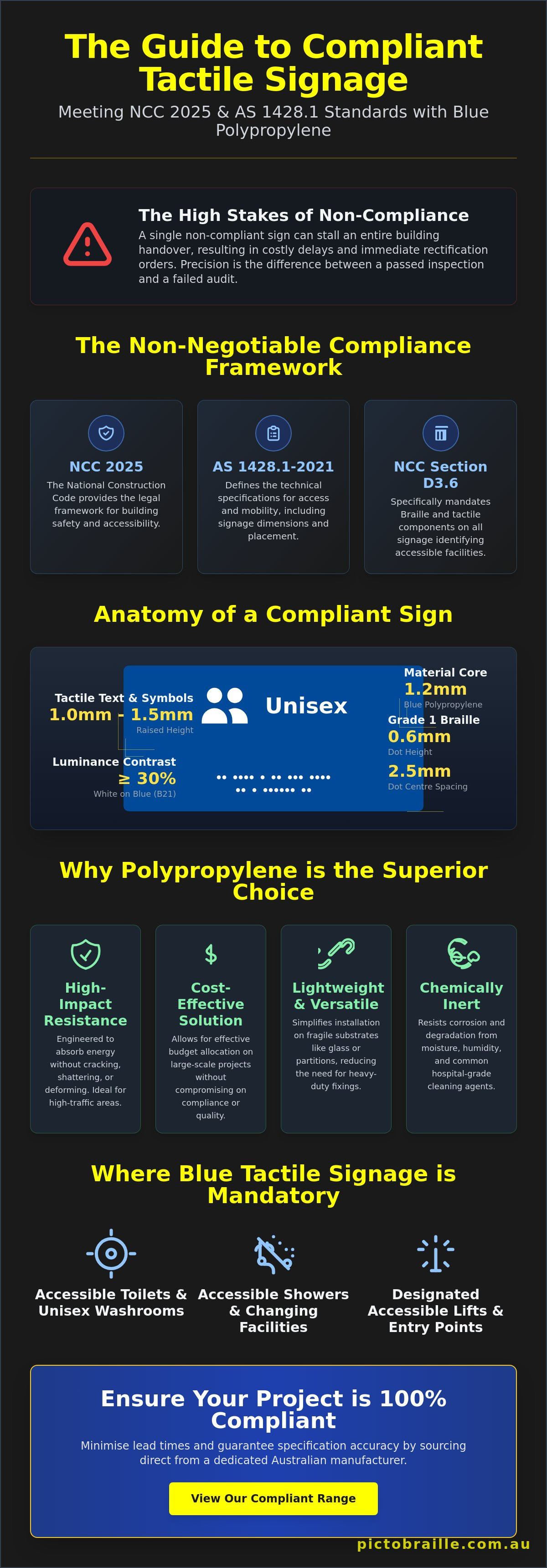
A single non-compliant sign can stall an entire building handover, resulting in costly delays and immediate rectification orders. You're likely aware that meeting the National Construction Code (NCC) 2025 and AS 1428.1-2021 standards is a non-negotiable requirement for any Australian commercial project. It's a high-stakes environment where technical precision outweighs aesthetic preference. Precision is the difference between a passed inspection and a failed audit.
This guide provides the regulatory clarity you need to source blue polypropylene tactile signs that are 100% compliant with current accessibility laws. We'll help you master the 30% luminance contrast requirements and material specifications necessary to pass your final inspection without friction. You'll learn how to evaluate durability for high-traffic environments and navigate the staggered adoption of NCC 2025 across different states and territories. We also detail the benefits of sourcing directly from an Australian manufacturer to ensure technical accuracy and long-term performance. Don't leave your project's certification to chance when compliance is a matter of exact measurements and verified standards.
Key Takeaways
- Verify NCC 2025 and AS 1428.1-2021 compliance to avoid inspection failures and costly project rectification.
- Utilise our blue polypropylene tactile signs to achieve superior impact resistance and cost-efficiency in high-traffic commercial environments.
- Apply precise LRV measurements, focusing on the 12.14% benchmark, to meet mandatory luminance contrast standards.
- Select correct signage configurations, including LH/RH transfer and ambulant options, based on specific facility layouts.
- Minimise lead times and guarantee specification accuracy by sourcing directly from a dedicated Australian manufacturer.
Understanding Braille and Tactile Signs in the Australian Context
Braille and tactile signs serve as the primary standard for identifying accessible facilities in Australian commercial developments. These signs provide immediate visual and tactile recognition for users with varying levels of vision impairment. We manufacture these signs using 1.2mm polypropylene to ensure a lightweight yet exceptionally robust solution. This specific thickness provides the ideal balance between flexibility and impact resistance. It's a functional choice that prioritises longevity and ease of mounting on diverse wall surfaces without the risk of warping. The material's durability ensures it stands up to the rigours of high-traffic environments like schools, hospitals, and shopping centres.
The manufacturing process is strictly regulated to ensure tactile readability. Each sign features raised white text and symbols that stand 1mm to 1.5mm above the blue base. This elevation is critical for physical identification by touch. High-contrast white on a blue background ensures the signage meets mandatory luminance contrast requirements. This colour combination isn't just about aesthetics; it's a technical requirement for accessibility compliance in the Australian built environment. Using precise injection moulding or thermoforming techniques ensures that every character and icon is sharp and easily detectable.
The Standard for Accessible Facilities
Blue signage is the universal visual shorthand for inclusivity in Australia. It signals the presence of "Access" and "Unisex Accessible" facilities to all building occupants. Consistent colour coding is vital because it allows vision-impaired users to develop a reliable mental map of public spaces. When a user sees this specific shade of blue, they immediately identify it with accessible amenities. This system often integrates with Tactile Paving and other indicators to form a complete navigational network. The following facilities must use blue tactile signage:
- Accessible Toilets and Unisex Washrooms.
- Accessible Showers and Changing Facilities.
- Designated accessible entry points and lifts.
NCC Section D3.6 and AS1428.1 Compliance
The National Construction Code (NCC) provides the legal framework for building safety, while AS1428.1 defines the technical specifications for access and mobility. Section D3.6 of the NCC specifically mandates Braille and tactile components on all signage identifying accessible paths and facilities. You won't receive a certificate of occupancy if your signage fails these standards. Compliance requires more than just having a sign; the Braille must be accurate and physically reachable. Braille dots must be embossed to a height of 0.6mm with a consistent 2.5mm spacing between dot centres to ensure they're legible to touch-readers. Using compliant blue polypropylene tactile signs ensures your project meets these rigid technical benchmarks during the final inspection.
Material Science: Why Polypropylene Outperforms the Competition
1.2mm polypropylene is engineered for high-impact resistance. It doesn't shatter or crack like thinner plastics or brittle composites. This flexibility is essential in environments where signage is subject to physical contact or accidental strikes. The physical properties of the polymer allow it to absorb energy without permanent deformation, ensuring the sign remains flat and readable for the duration of the building's life cycle. It's a functional choice that prioritises structural integrity in demanding settings.
Cost-efficiency is a primary driver for large-scale commercial projects. Choosing blue polypropylene tactile signs allows builders to allocate budget effectively while maintaining strict adherence to AS 1428.1. These signs are significantly lighter than metal alternatives. This reduced weight simplifies installation on fragile substrates like glass or thin partitioning, as it doesn't require heavy-duty mechanical fixings. The material is also chemically inert, meaning it won't corrode or react when exposed to the moisture levels typically found in Australian coastal environments or humid washrooms.
Durability in High-Traffic Environments
Public centres and schools require signage that resists scratching and fading. Polypropylene's matte finish is a functional choice; it diffuses light to reduce glare. This is a critical factor for low-vision users who struggle with reflections on polished surfaces. Cleaning is straightforward. The material withstands common hospital-grade disinfectants and aggressive washroom chemicals without degrading the tactile characters or Braille dots. Regular maintenance with standard cleaning agents won't cause the blue pigment to leach or the white icons to peel, as the colour is often integrated into the material itself.
Polypropylene vs. Anodised Aluminium
Metal signs like Anodised Aluminium offer a premium aesthetic but come at a higher price point. Polypropylene is the logical choice for high-volume installations where functionality and budget are the priorities. The tactile experience is often described as "warmer" than metal, which some users prefer for touch-reading in colder climates. From an environmental perspective, polypropylene is 100% recyclable, aligning with modern green building standards and waste reduction targets. Adhering to the Australian Disability Network guidelines ensures that your material selection supports the broader goals of inclusive design. If you need a robust, compliant solution for your next project, consider the range of blue polypropylene signs available for direct supply.
Luminance Contrast and LRV: The Key to Passing Inspection
Passing a building inspection requires adherence to strict luminance reflectance values (LRV). AS 1428.1-2021 defines these requirements to ensure facilities remain accessible to people with vision impairments. Our blue polypropylene tactile signs feature a specific LRV of 12.14%. This benchmark is a critical data point for architects and builders. It allows for precise calculations before any signage is fixed to a wall. Using a verified LRV removes the guesswork from compliance. You can confirm suitability during the design phase rather than risking a failure during the final walkthrough.
The 30% contrast rule is the standard for visibility. A sign must stand out from its background. If the wall and the sign share similar reflectance values, the signage becomes invisible to many users. White text and icons on the blue background provide the necessary internal contrast. This internal contrast is what makes the information legible. Without it, the tactile features lose their functional purpose. Professional installers prioritise these values to ensure every occupant can navigate the building safely.
Calculating Contrast for Your Project
Builders must check if a blue sign is suitable for their specific wall colour. A common pitfall is installing blue signs on dark grey, navy, or charcoal walls. These dark surfaces often have low LRVs, resulting in a contrast failure. To pass inspection, you must compare the LRV of the sign (12.14%) with the LRV of the mounting surface. The NCC mandates the use of the Bowman-Sapolinski formula, C = 125(Y1 - Y2) / (Y1 + Y2 + 25), to calculate the luminance contrast between the signage and the mounting surface. If the result is below 30%, you'll need to use a contrasting border or select a different mounting location.
Internal vs. External Contrast Requirements
Internal contrast between the icon and the sign background is non-negotiable for compliance. The raised white symbols are designed to provide maximum visibility against the blue polymer, ensuring the sign is useful for both sighted and vision-impaired individuals. We apply a matte or low-sheen finish to every sign to prevent specular reflection. High-gloss surfaces create glare that obscures information, especially under bright commercial lighting or near large windows. This finish ensures the tactile features remain the focal point for the user.
Braille legibility must remain consistent regardless of environmental lighting conditions. Shadows can interfere with the way a user perceives tactile characters, so uniform reflectance is essential. By maintaining a 12.14% LRV on the background and high-contrast white for the raised elements, the sign remains functional in low-light corridors or stairwells. Compliance isn't just a box-ticking exercise; it's a commitment to safety and accessibility standards across the Australian built environment. Using the right materials ensures your project meets these rigid technical benchmarks without compromise.
Selection and Installation Guide for Trade Professionals
Selecting the correct blue polypropylene tactile signs requires a precise understanding of the facility layout. It is not a generic process. Every commercial project requires a specific mix of Unisex Accessible, Male, Female, and Ambulant signage to meet NCC requirements. Ambulant toilets are designed for individuals with mobility limitations who do not require a wheelchair. These facilities must have distinct signage that is separate from fully accessible or standard toilet icons. Failure to differentiate between these types during the procurement phase will lead to immediate rejection by a building certifier.
Left-hand (LH) and Right-hand (RH) transfer signs are critical for wheelchair-accessible cubicles. These signs must correspond exactly to the grab rail configuration inside the room. If the grab rails are on the left of the pan, an LH transfer sign is mandatory. Modern Australian building design also sees a rise in "All Gender" signage. These inclusive options must still adhere to the same tactile and Braille standards as traditional gendered signs to maintain full compliance. Precision in selection ensures the signage serves its functional purpose for all building occupants.
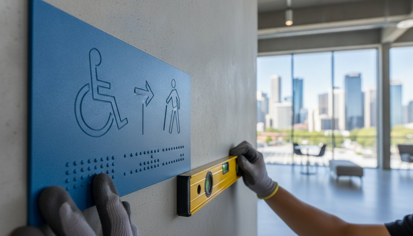
Installation heights are strictly mandated by AS 1428.1. All tactile and Braille components must sit within a height range of 1200mm to 1600mm above the finished floor level (FFL). This range ensures the information is accessible to the majority of users, including those in wheelchairs or with limited reach. Measuring from the FFL is essential; do not measure from a raw slab before floor finishes are applied. Maintaining this consistency across a site demonstrates professional competence and simplifies the final audit process.
Mounting Locations: Wall vs. Door
The primary rule for signage placement is the latch side of the door. This location allows a vision-impaired user to locate the sign and the door handle simultaneously without being struck by an opening door. You must position the leading edge of the sign between 50mm and 300mm from the architrave. If wall mounting is impossible due to glazing or lack of space, you may mount the sign directly onto the door. This is only permissible if the door is fitted with a door closer to ensure it remains in a predictable position.
Adhesives and Fixings for Polypropylene
A permanent bond is required for all public signage. Double-sided VHB (Very High Bond) tape is the industry standard for fixing polypropylene to smooth surfaces like glass or painted plasterboard. For porous masonry or external walls, we recommend a combination of VHB tape and a neutral-cure silicone to prevent moisture ingress. Use a spirit level for every installation; a crooked sign is a visual indicator of poor workmanship and may be rejected during a meticulous inspection. Ensure your project passes the final handover by sourcing your blue polypropylene signs directly from a specialist Australian manufacturer.
Sourcing Direct: The Pictobraille Manufacturing Advantage
Direct procurement from an Australian manufacturer is a strategic choice for trade professionals. It ensures that blue polypropylene tactile signs are fabricated to exact technical specifications without the variance common in imported alternatives. We maintain strict control over the material science and manufacturing tolerances at Pictobraille, specifically the 12.14% LRV and 1.2mm thickness benchmarks. This oversight reduces project risk. You're dealing with the experts who understand the National Construction Code, not a generalist reseller. This direct relationship streamlines communication and ensures lead times remain predictable for critical project milestones.
Customisation remains a core capability of our production facility. We can integrate blue polypropylene with bespoke building requirements, adapting the sign dimensions to fit specific architectural details while maintaining mandatory tactile and Braille positioning. Supporting local industry ensures that your signage package is backed by technical support that understands the nuances of the Australian built environment. Compliance is a non-negotiable outcome of our manufacturing process. By eliminating the middleman, you reduce acquisition costs while gaining access to technical expertise that guarantees a passed inspection.
Quality Control in Fabrication
Consistency across large orders is the primary benefit of in-house manufacturing. We verify that every sign meets the rounded edge requirements of AS 1428.1, which is a detail often overlooked by non-specialist suppliers. These rounded edges are essential for both safety and preventing the sign from being caught and peeled away in high-traffic corridors. Our fabrication process ensures that tactile characters and Braille dots are embossed with permanent precision. This reliability gives you the peace of mind needed when preparing for a final inspection and the subsequent occupation certificate.
Streamlining Your Signage Order
Efficiency on-site starts with a well-organised signage schedule. We recommend builders and trade professionals compile a comprehensive list of all required door types, including Unisex Accessible, Ambulant, and gender-specific facilities. Grouping these by transfer direction (LH or RH) ensures no gaps in the final order. To achieve a fully compliant site, consider the value of Slim Exit signs and Fire Signage as part of a consolidated package. This approach ensures all safety and accessibility markers share the same high manufacturing standards. View our full range of Blue Polypropylene Signs and ensure your project is compliant to secure your building's final handover.
Secure Your Building Certification with Technical Precision
Achieving a successful project handover requires more than just high-quality materials; it demands strict adherence to the National Construction Code. Compliance rests on precise technical measurements, specifically the 12.14% LRV benchmark for luminance contrast. By implementing the correct installation heights and latch-side positioning, you ensure your facility meets the rigid standards of AS 1428.1-2021. Selecting blue polypropylene tactile signs from a specialist manufacturer provides the durability and impact resistance needed for high-traffic Australian environments.
Pictobraille is Australian Made & Owned, delivering precision-engineered solutions that guarantee compliance with every order. We provide direct manufacturer pricing for trade professionals, ensuring your project remains cost-effective without compromising on regulatory accuracy. Don't leave your final occupancy certificate to chance by using unverified signage. Order your NCC-compliant Blue Polypropylene Signs direct from the manufacturer today to secure your project's success. Your commitment to inclusive design starts with the right technical partner.
Frequently Asked Questions
Are blue polypropylene signs mandatory for all disabled toilets in Australia?
The material itself isn't mandatory, but tactile and Braille components are compulsory for all accessible toilet facilities under NCC Section D3.6. Blue is the industry-standard colour for "Access" and "Unisex Accessible" signage across Australia. Using this specific colour ensures immediate visual recognition and consistency for vision-impaired users navigating public spaces. While you can use other materials like stainless steel, blue polypropylene remains the most common choice for functional compliance.
What is the required LRV contrast for a blue tactile sign to be compliant?
Compliant signage requires a minimum luminance contrast of 30% between the sign background and the mounting surface. Our blue polypropylene tactile signs feature a verified LRV of 12.14%. You must use this value in the Bowman-Sapolinski formula to confirm the wall colour provides sufficient contrast. If your wall is a dark shade, the contrast may fall below the 30% threshold, requiring a contrasting border or a different mounting location.
Can I install blue polypropylene signs outdoors, or will they fade?
You can install these signs in outdoor environments because polypropylene is inherently resistant to moisture and many common chemicals. The material is chemically inert and maintains its structural integrity in Australian coastal conditions. We use UV-stable pigments during the manufacturing process to resist fading and degradation from direct sunlight exposure. This ensures the sign remains legible and compliant for the duration of the building's life cycle.
How high should I mount a Braille sign according to the NCC?
Mount all Braille and tactile signage within a height range of 1200mm to 1600mm above the finished floor level (FFL). This range is mandated by AS 1428.1 to ensure information is physically reachable for all users, including those in wheelchairs. It's critical to measure from the final floor finish, such as tiles or carpet, rather than the raw concrete slab. Incorrect mounting heights are a frequent cause of building inspection failures.
Is there a difference between "Unisex Accessible" and "Ambulant" signage requirements?
Yes, distinct requirements exist for these two types of facilities. Unisex Accessible signs identify fully accessible cubicles designed for wheelchair users. Ambulant signs identify cubicles equipped with specific grab rails for people with mobility limitations who don't require a wheelchair. You must install the correct icon to match the internal fit-out of the facility. Mixing these up will lead to a non-compliance report from your building certifier.
Do blue polypropylene signs need to be a specific size?
Signage must be sized appropriately to accommodate mandatory tactile characters and Braille text as specified in AS 1428.1. Standard compliant signs are often 180mm x 235mm or 180mm x 180mm depending on the icon and text requirements. The surface area must be large enough to allow for the 1mm to 1.5mm raised icons and correct Braille spacing. Using pre-fabricated compliant signs ensures these dimensions are met without the need for manual adjustment.
What happens if my signage doesn't meet the 30% luminance contrast rule?
Failing the 30% luminance contrast rule results in a failed building audit and a delay in receiving your occupation certificate. You'll be required to rectify the issue by either relocating the sign to a more contrasting surface or installing a contrasting border plate behind the sign. This rectification process adds unnecessary labour costs and can stall project handovers. Verifying the LRV of your blue polypropylene tactile signs against the wall colour during the design phase prevents this issue.
Why does Pictobraille use 1.2mm thickness for their polypropylene signs?
We use a 1.2mm thickness because it provides the optimal balance between impact resistance and mounting flexibility. This specific gauge ensures the sign remains robust in high-traffic environments like schools and hospitals while being light enough for secure mounting on glass or thin partitions. It's a functional choice that prioritises structural integrity without the weight of thicker, more expensive materials. This thickness also ensures the sign sits flush against the wall to prevent it from being easily tampered with.